Conducive to Learning Environment: Create a Conducive to
You’re probably sitting on one of two setups right now.
Either you’ve built a course that’s basically a stack of lessons, a checkout page, and a hope that students will stay motivated on their own. Or you’re using a hosted platform that makes publishing easy enough, but every meaningful change feels gated by plan limits, template restrictions, or recurring costs that keep growing as your school grows.
That’s where the phrase conducive to learning environment stops being academic and starts being operational. In digital education, the environment isn’t your logo, your lesson count, or your launch funnel. It’s the sum of what learners experience when they try to move through your campus. Can they tell what to do next? Do they feel supported when they get stuck? Are they challenged without being overwhelmed? Can they participate in ways that fit how they learn?
A strong digital campus doesn’t happen because the platform has a “course” feature. It happens because the platform gives you enough control to shape behavior, reduce friction, and support momentum. That’s why self-hosted systems matter. When you own the environment, you can design for learning first instead of bending your pedagogy around someone else’s software rules.
The Blueprint for a Thriving Digital Learning Space
A digital learning environment isn’t just the screen where lessons appear. It includes navigation, pacing, communication, assessment, peer interaction, and the subtle signals that tell a learner whether they’re making progress or falling behind.
The most useful framework I’ve found for building a conducive to learning environment online comes from research that identifies five interacting conditions: clarity, challenge, support, agency, and reflection. The key point is that these conditions work together, not separately, and learner perception of the environment is positively connected to motivation and outcomes, as described in TeachThought’s summary of the framework.
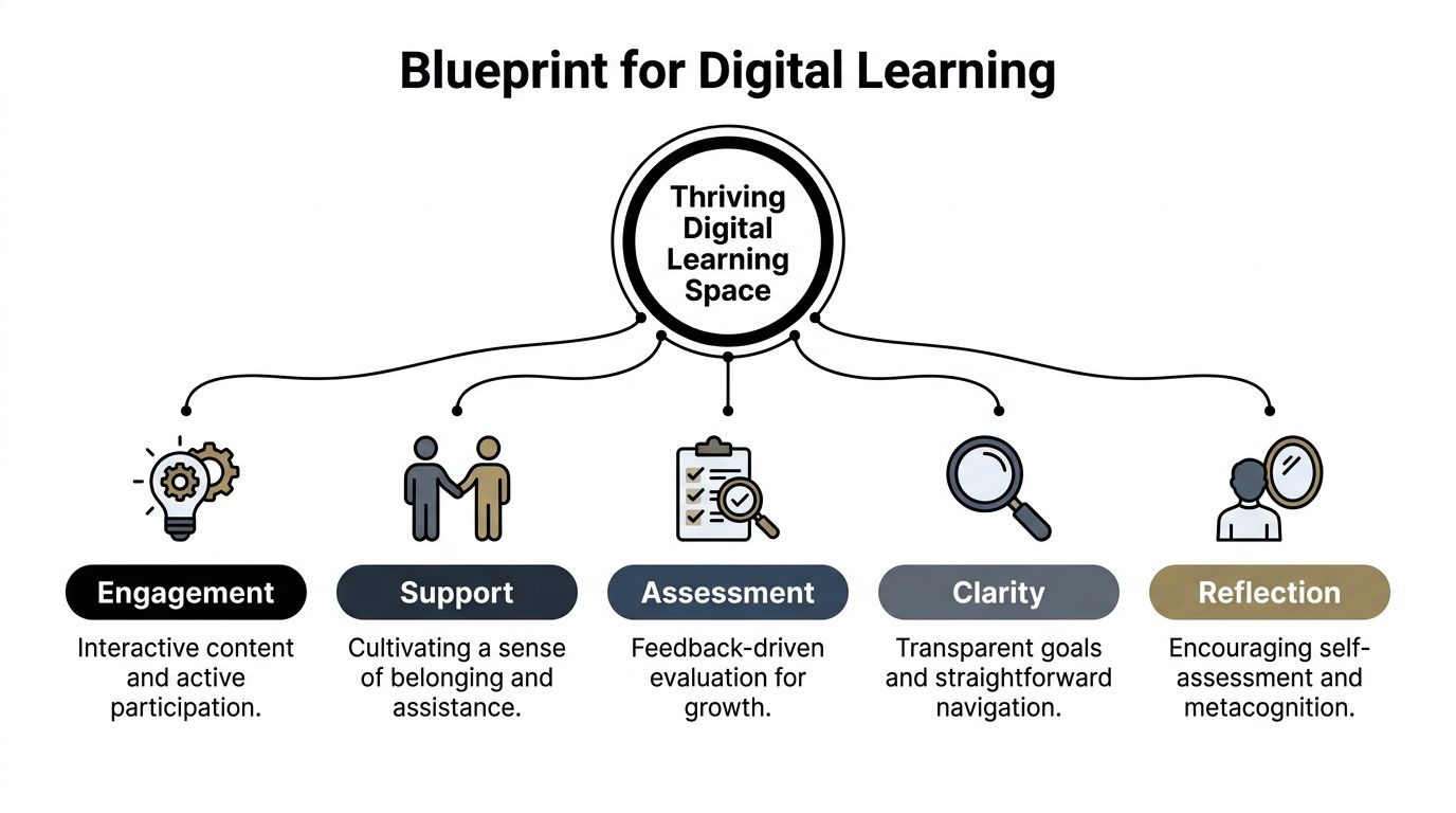
Clarity reduces anxiety
Online learners quit unannounced. They don’t raise a hand and ask where the worksheet is. They leave.
Clarity fixes that. Learners need to know where to start, what success looks like, how each lesson connects to the next, and what to do if they fall behind. In a well-structured platform, clarity shows up in visible course progression, clean lesson naming, obvious deadlines, and dashboards that don’t bury the next action.
When creators study a more learner-centered strategy, they usually realize that course design isn’t mainly about content volume. It’s about reducing uncertainty.
Practical rule: If a new student needs to “figure out” your platform before they can learn, the environment is doing extra work against them.
Challenge creates productive effort
A course with no friction feels easy to sell and hard to finish. Learners need meaningful challenge, not just content consumption.
That doesn’t mean making everything harder. It means asking students to retrieve, apply, compare, decide, create, and defend. The best digital courses don’t rely on long passive video stretches. They alternate explanation with response. A learner watches, then answers. Reads, then applies. Practices, then revises.
Challenge also needs calibration. If you overload beginners, they disengage. If every task is obvious, they coast. Good platform design lets you stage difficulty so effort feels purposeful rather than punishing.
Support makes persistence possible
Support is where many course businesses fail. They assume content quality can compensate for learner isolation. It usually can’t.
Support includes instructor presence, accessible help channels, guided feedback, reminders, announcements, and social signals that say, “You’re not lost, and someone will notice if you stall.” Smaller touches matter too. A welcome message matters. A progress dashboard matters. A discussion area with active moderation matters.
Agency builds commitment
Learners commit more fully when they can make choices inside the environment. Agency can be simple. Let them choose the order of some modules, pick between assignment formats, join live or recorded paths, or revisit materials without penalty.
This is one reason rigid SaaS templates often become a design problem. If the platform forces one narrow experience, learners end up adapting to the software instead of the learning model adapting to them.
Reflection turns activity into growth
A busy course isn’t always an effective one. Reflection is what helps learners interpret performance and change behavior.
That can happen through progress tracking, self-check quizzes, review prompts, peer discussion, retake analysis, and feedback that tells students more than whether they were right or wrong. Reflection closes the loop. Without it, learners stay active but don’t become more capable.
Here’s the practical takeaway. If you want a digital campus that is conducive to learning, stop thinking like a publisher and start thinking like an environment designer. The course content is only one piece. The core work is how the system shapes learner behavior day after day.
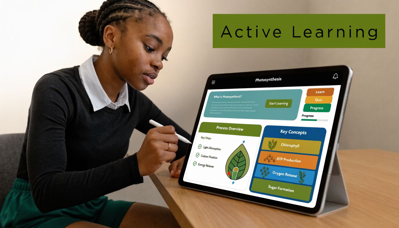
Designing Your Curriculum for Active Engagement
Most weak online courses don’t fail because the creator lacks expertise. They fail because the curriculum behaves like a file cabinet. Students open drawers, consume information, and leave without momentum.
A better curriculum behaves like a guided route. Each lesson answers a specific need, prepares the learner for the next task, and keeps cognitive load under control.
A useful starting point is to treat the drag-and-drop curriculum builder as a sequencing tool, not just a content organizer. Put the outcome first, then map backward. Learners should see a path that feels deliberate: orientation, core concept, guided practice, independent task, review, next step.
A breakdown of different teaching styles helps here because it reminds creators that one delivery method won’t fit every objective. Some lessons need direct explanation. Others need exploration, demonstration, or practice with feedback.
Build the path before adding the media
I usually recommend a simple curriculum test before uploading anything. For every lesson, answer four questions:
- What should the learner be able to do after this lesson
- What confusion is most likely here
- What activity proves understanding
- What should happen next
If you can’t answer those quickly, the lesson probably isn’t ready.
A flexible environment matters because structure affects engagement. In a Steelcase Education study, 84% of students reported higher engagement and 72% felt more motivated in active, flexible learning environments compared with traditional rigid setups. The same design principle carries into digital instruction. When your curriculum gives learners room to act instead of just watch, participation improves.
Use format variety with intent
Don’t mix media just to make the course look modern. Use each format for a reason.
| Format | Best use inside a digital campus |
|---|---|
| Video | Demonstration, walkthroughs, instructor presence |
| Audio | Review content, mobile-friendly reinforcement |
| Documents | Reference guides, checklists, templates |
| Assignments | Application, performance evidence |
| Drip content | Pacing, reducing overload, protecting sequence |
Creators often dump everything open on day one because it feels generous. It usually backfires. Drip content can keep beginners from sprinting into advanced material before they’ve built foundations. It also gives your communication rhythm more impact because each release feels like a milestone rather than another folder.
A course becomes more engaging when each lesson earns its place. If two consecutive lessons ask the learner to do the same kind of thinking, one of them is usually unnecessary.
Later in the build, it helps to show learners how the experience will feel across media and pacing. This walkthrough format does that well:
What works and what doesn’t
A lot of curriculum decisions sound minor but change completion behavior.
- What works: Clear module naming. “Write a landing page headline” is better than “Module 3 lesson 2.”
- What works: Shorter units with an obvious action at the end.
- What works: Assignments that force use, not recall.
- What doesn’t: A wall of videos with no checkpoints.
- What doesn’t: Releasing advanced lessons before learners know the vocabulary.
- What doesn’t: Treating downloadable PDFs as if they are learning activities.
When creators build with a self-hosted LMS, they can shape these mechanics around the course rather than accept a fixed course template. That freedom matters. Active engagement isn’t a plugin you turn on. It’s the result of dozens of design choices that keep learners moving.
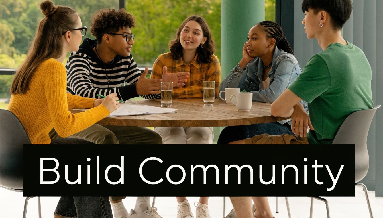
Fostering Community and Connection
One of the clearest signs that a digital course isn’t working is silence.
Students log in, finish lessons alone, submit work into a void, and disappear. Nothing feels broken from a technical standpoint, but the environment feels empty. That kind of emptiness kills persistence faster than most creators expect.
Research summarized by All4Ed on positive learning environments ties safety, engagement, and connectedness to stronger academic outcomes such as higher grades, better test scores, and better attendance. It also notes the importance of student-centered approaches and faculty-student relationships for sustaining engagement. In practice, that means your digital campus needs social architecture, not just content architecture.
A quiet forum is usually a design problem
I’ve seen creators add community features and then conclude that “students just don’t use forums.” Usually the issue isn’t the forum. It’s the prompt design, the timing, or the lack of visible instructor presence.
Per-course discussion forums work best when they support specific course moments. A thread called “General discussion” rarely goes far. A thread called “Post your first draft headline and give feedback to two peers” creates a reason to participate.
Here’s a simple scenario that tends to work. In week one, students introduce themselves and state a concrete goal. In week two, they share an early assignment attempt. In week three, they reflect on a mistake they corrected. The forum becomes part of the curriculum, not a side feature no one remembers.
Presence needs a cadence
Announcements and newsletter broadcasts do more than share updates. They establish rhythm.
A strong cadence might include a welcome note, a midweek checkpoint, a reminder before a live class, and a summary after a major assignment. This doesn’t need to be long. It needs to be timely and human. Students notice when the instructor is actively steering the room.
For creators looking beyond platform mechanics, Kuraplan’s guide to strategies for building a classroom community is worth reading because many of its principles translate cleanly to online delivery. Belonging isn’t created by posting “be kind” in a sidebar. It’s created by repeated routines that invite contribution and recognize it.
Learners don’t need constant chatter. They need evidence that someone is tending the space.
Live moments and peer proof
Not every course needs weekly live sessions, but many courses benefit from occasional real-time contact. Zoom integration can handle office hours, critique sessions, cohort kickoffs, or exam prep. The point isn’t to recreate a classroom hour for hour. The point is to reduce the emotional distance between learner and instructor.
A few other features also help strengthen connection:
- Student reviews: They reassure new learners that people like them have completed the journey.
- Instructor replies: They model the tone you want students to use with each other.
- Pinned discussion threads: They keep recurring questions from scattering across the platform.
- Course-specific spaces: They prevent a marketplace or academy from feeling like one big anonymous feed.
Community doesn’t need to be noisy to be effective. It needs to be dependable. When learners know where to ask, when to show up, and how they’ll be answered, the environment starts feeling alive.
Implementing Meaningful Assessment and Feedback
Assessment is where many digital courses expose their weakest assumptions.
A lot of creators still treat testing as a final checkpoint. Students watch everything, then take one exam, then receive a score. That model is tidy for administration and poor for learning. It tells you who passed. It doesn’t do much to help learners improve while improvement is still possible.
A better approach treats assessment as an ongoing feedback loop. The learner attempts something, sees what happened, adjusts, and tries again. That loop supports challenge, clarity, and reflection at the same time.
Match the question type to the thinking type
One of the biggest mistakes I see is using the same question format for everything. If all you ever use is multiple choice, you end up measuring recognition more than understanding.
A stronger exam system lets you vary the demand. Different question types can check different forms of thinking.
| Assessment need | Better format choice |
|---|---|
| Recall of terms or facts | MCQ or fill-in-the-blanks |
| Sequence and process | Ordering questions |
| Association and categorization | Matching |
| Listening comprehension | Listening-based items |
| Applied performance | Manual assignments or project submissions |
That variety matters because it makes the assessment feel like part of instruction rather than a generic quiz engine. A standalone exam system with 7 question types, auto-grading, fullscreen mode, countdown controls, and attempt history gives creators enough room to test knowledge in ways that fit the subject instead of flattening everything into one pattern.
Fast feedback beats delayed judgment
Auto-grading is useful when it shortens the distance between effort and response. That’s the main benefit.
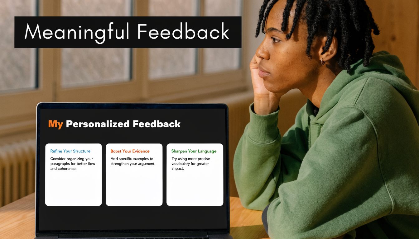
If a learner answers a formative check and immediately sees where they misunderstood, they can correct before the misconception hardens. Attempt history also adds value because students can review patterns in their own errors. They stop seeing assessment as a random series of right and wrong moments and start seeing it as evidence.
Design choice: Put low-stakes checks close to the lesson where confusion begins, not at the end of the module when learners have already built on the wrong idea.
Manual assignments matter just as much. They’re better for complex work like writing, design critique, lesson planning, analysis, or scenario-based corporate training. For these, personalized comments offer capabilities automation cannot match. You can point to a weak decision, explain why it failed, and tell the learner what to revise next.
Completion signals matter more than creators think
Certificates and marksheets can be useful, but only when they sit on top of real mastery signals. They shouldn’t replace meaningful assessment. They should mark the completion of it.
Here’s what tends to work in practice:
- Frequent low-stakes checks: Use them after key lessons so confusion shows up early.
- One or two deeper assignments: Reserve these for applied work that needs human review.
- Clear pass conditions: Students should know what counts as complete and what requires revision.
- Visible progress records: Marksheets and completion records help learners and organizations track movement through the program.
This approach also makes better business sense for serious academies and training teams. Exams can stand alone when needed, and assignments can support course-based learning when context matters. You aren’t trapped in one credentialing model.
The strongest digital environments use assessment to teach. The weakest ones use it only to sort.
Building an Accessible and Inclusive Space for All
A lot of creators still assume accessibility is expensive, highly technical, or only relevant for large institutions. That assumption causes real damage because it pushes inclusivity into the “later” pile.
In practice, many of the most effective accessibility improvements are design choices. Cleaner navigation. Multiple content formats. Better labeling. Simpler page structure. Language flexibility. Predictable layouts. These changes help everyone, not only learners with identified support needs.
Self-hosted systems are especially useful here because they let you adapt the environment to the learners you serve. A summary on conducive learning environments for underserved children highlights that self-hosted LMS platforms can support underserved learners through customization, multilingual support, and flexible page builders while avoiding vendor lock-in and recurring SaaS costs. That matters when you’re building for communities with different languages, different devices, or different support needs.
Inclusive design is mostly practical empathy
A creator building an inclusive course should ask questions like these:
- Can learners understand the interface quickly
- Can they consume key material in more than one format
- Can they revisit instructions without hunting
- Can they use the platform in their own language
- Can they progress without relying on one narrow mode of participation
Multilingual dashboards and RTL or LTR support matter because language friction isn’t a minor inconvenience. It changes confidence, speed, and willingness to continue. Flexible page builders matter because cluttered layouts create unnecessary cognitive load, especially for learners who need a calmer visual environment.
Ownership makes accessibility easier to sustain
Self-hosting beats many SaaS products in day-to-day practice. With a hosted tool, accessibility often means waiting for the vendor to expose the right settings or accepting whatever theme logic they’ve decided to support. With a self-hosted platform, teams can adjust templates, content presentation, authentication flow, communications, and support structures to match their learners.
Creators who want a broader overview of tools outside the LMS itself should review this guide to assistive technology for students. It’s useful because inclusive environments rarely depend on one feature alone. They come from how content design, device support, and learner tools work together.
A conducive to learning environment isn’t inclusive because it says it is. It’s inclusive because learners with different needs can move through it, understand it, and succeed in it without constant workaround behavior.
Your Environment, Your Rules
The strongest digital campuses don’t feel accidental. They feel coherent.
Learners know where to begin. The curriculum asks them to act, not just consume. Community feels available instead of ornamental. Assessments teach while they evaluate. Accessibility is built into the environment rather than patched on after complaints arrive. Those are design choices.
There’s also a concrete operational reason to care. Research summarized in Learning Liftoff’s review of NYC Schools findings reports that positive learning environments can produce gains equivalent to 1.5 months of additional math instruction and can reduce teacher turnover by 25%. That’s a strong reminder that environment design isn’t cosmetic. It affects outcomes and sustainability.
What SaaS often gets wrong
Hosted platforms are convenient until your environment needs to behave differently from the default. That’s the trade-off.
If you need unusual assessment flows, deeper control over roles, custom page logic, marketplace behavior, regional payment setups, language handling, or a branded learner journey that doesn’t look like everyone else’s, convenience starts colliding with constraints. Then the monthly bill keeps arriving while your design freedom stays limited.
A self-hosted, one-time purchase LMS changes that equation. You control the structure, the updates, the business model, the visual experience, and the long-term direction. You’re not renting the right to operate your own school.
Build for the learners you actually have
That’s the practical advantage many creators miss. A conducive to learning environment isn’t a universal template. It’s a response to a specific audience.
A solo educator may need a focused school with clean progression and simple feedback loops. An agency may need a white-label academy with multiple instructors and client-specific branding. A company may need exams, marksheets, and permissions that support compliance training. A marketplace operator may need instructor dashboards, payouts, reviews, and strong course-level community features. Those aren’t edge cases. They’re normal use cases.
If your platform can’t adapt, your learning environment weakens over time because your business evolves and the software doesn’t.
Build the environment first. Then let content, community, assessment, and accessibility reinforce it. That’s what makes an online school feel stable, useful, and worth returning to.
If you want full control over that kind of digital campus, Mentor LMS is built for it. It gives solo creators, training teams, agencies, and marketplace operators a self-hosted LMS with a one-time purchase model, full source-code ownership, drag-and-drop course building, standalone exams, multilingual dashboards, role-based access, flexible payments, and no vendor lock-in. If your goal is to create a learning environment that fits your students instead of a template, it’s worth exploring.